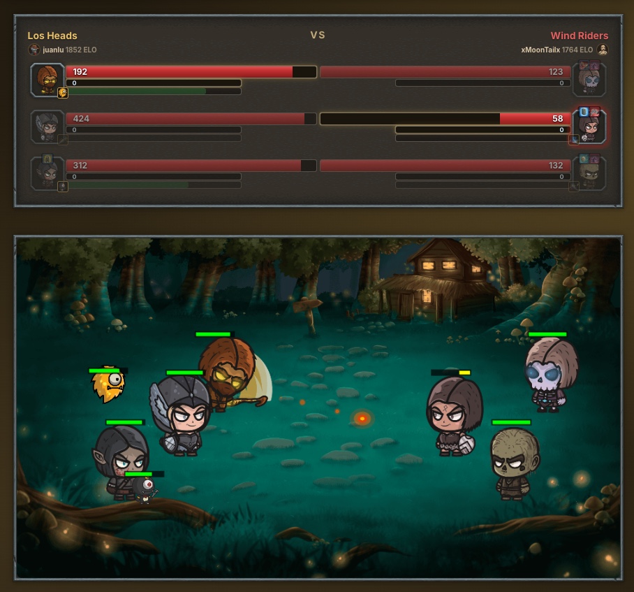
All three erandel.com games —Triara, Picturim and Vectron— are designed for a phone screen first and then allowed to grow toward the desktop, not the other way round. I do not do it because it is trendy, but because the small screen is one of the best design constraints I know. What does not fit on a phone is, almost always, the stuff you did not need.
The thumb is in charge
On a phone almost everything is touched with one thumb, and the thumb neither reaches everywhere nor lands on tiny targets. That forces honest decisions: the important buttons go at the bottom and they are big; dangerous actions do not sit right next to harmless ones. When a game feels comfortable one-handed on the bus, it almost always feels good with a mouse too.
320 pixels as a filter
If a screen has to work at 320 pixels wide, you cannot cram five columns of information at once. You have to choose what matters now and hide the rest behind a tap. That discipline has improved all three games: Triara's shop, Picturim's board and Vectron's map are more readable on desktop precisely because they had to survive on a tiny screen first.
Initial load is design, not a technical detail
On desktop with a good connection, it barely matters if the site is a bit heavy. On a phone with weak data, it does. If your game takes ten seconds to open, a lot of people leave before playing. So I treat first-load weight as a design decision: load just enough to start, and leave the rest for later. A game that opens in two seconds invites "a quick round"; one that lags does not.
Readable text without zoom
It sounds obvious, but it is where most games fail: tiny text that forces you to zoom on mobile. If a Triara skill or a Picturim hint cannot be read at a glance in your hand, the problem is not the player's. The rule I follow is simple: if I have to bring the screen to my face to read it, it is wrong and it stays out.
What each game taught me
Triara taught me to hide depth without hiding clarity: there are many systems (classes, skills, pets, market), but each screen shows only what you need for the next decision. Picturim taught me that a well-made touch mechanic (scratching, tapping boxes) feels better on mobile than with a mouse, so there the phone is not the hard case, it is the ideal one. Vectron taught me the opposite: a spatial puzzle with small pieces is where mobile really squeezes, and it forced me to rethink sizes and touch zones so that placing a reflector was not a fight with your finger.
Why I keep insisting on this
Many people discover and play these games on a phone, opening a link a friend sent them. If that first impression is awkward, there is no second one. Designing mobile-first is, in the end, designing for the way people actually arrive at a web game. If you want to see how it turned out, it is all on the games page.