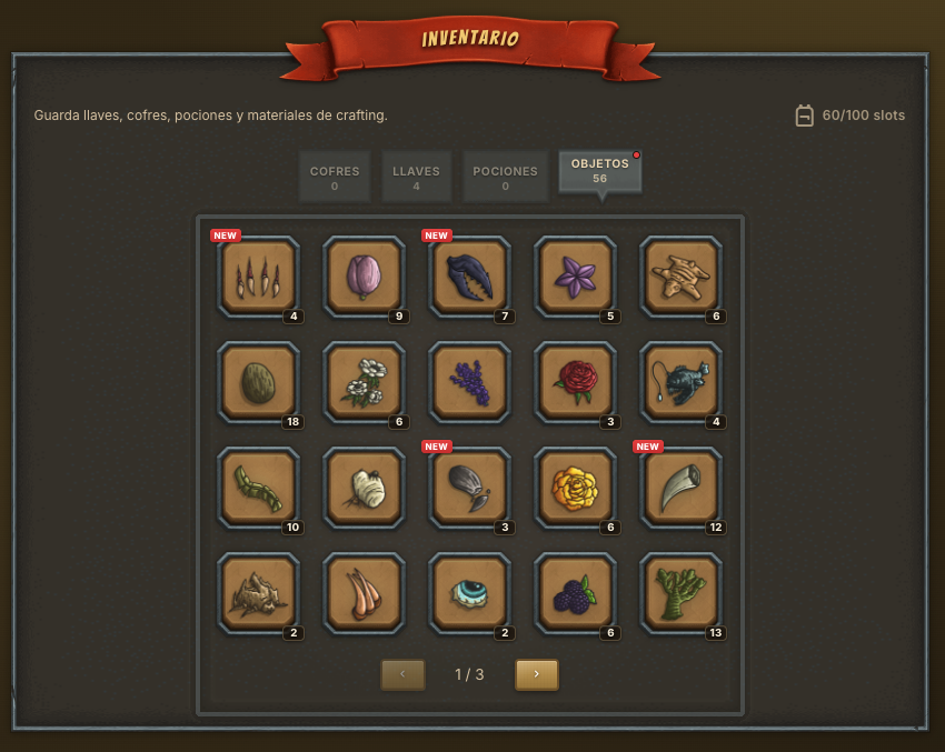
An RPG inventory feels like a secondary screen until it starts getting in the way. Then everything shows: you cannot find a key, you do not know which ingredient is missing for a potion, you open a chest and cannot tell where the reward went. In Triara I want the inventory to be quiet, but not invisible: it has to support the game loop without fighting it.
Triara has several item sources at once. You explore zones, gather materials, find keys, open chests, craft potions and prepare fights. If all of that lands in one flat list, the player spends more time sorting than deciding.
Loot needs context
Not every item serves the same purpose. A key is not like a potion, and a recipe is not like a common ingredient. So the first design decision was to separate the inventory by use: what opens something, what gets consumed, what gets crafted, and what is saved for later.
That separation also helps reward design. When an exploration gives loot, quantity is not the only thing that matters; the player should understand what they just gained and what new possibility it opens.
Bags are a form of pacing
An infinite inventory removes friction, but it also removes some rhythm. If you never have to look at what you carry, items lose weight. At the same time, a limit that is too harsh turns the game into heavy maintenance.
The idea behind bags in Triara is to live in the middle: enough capacity to play comfortably, but a little pressure to review, use potions, open chests and turn materials into real progress.
Potions are preparation, not emergency buttons
Triara's potions are not panic buttons during combat. They are prepared beforehand. That changes how they read inside the inventory: not immediate "extra life", but a strategic decision for a specific fight. Do I spend a damage potion now, or save it for a tougher Arena round?
That kind of small decision fits automatic combat well. Since you do not click during the fight, inventory becomes one of the screens where you do make active choices.
Chests and keys: delayed promise
I like chests because they are a promise. An exploration does not always have to give you the champion you wanted; it can give you the key that gets you closer to opening something later. That delay creates a tiny story: I found a key, saved another, opened the chest, got a new template, changed my team.
If the inventory presents that chain clearly, the player feels progress even before the big reward arrives.
Fewer screens, more intent
The temptation when adding systems is to create a new screen for everything. Market, forge, hut, chests, bags. Sometimes that is necessary, but every extra screen adds navigation. I am trying to make inventory the place where many of those lines meet without turning it into an admin panel.
The question I ask with every change is simple: does this help the player decide what to do next? If the answer is no, it probably does not belong there, or it belongs somewhere else.
Next
The next thing I want to improve is state clarity: which items are usable now, which are blocked by a recipe, which should be saved, and which are just material. I do not want the game to play itself for you, but I do want the interface to stop hiding important information.
In the end, a good inventory is not the one that shows the most data. It is the one that makes loot make sense.